Thursday, 3 April 2014

Wednesday, 2 April 2014
Saturday, 22 March 2014

Friday, 7 March 2014
Contents Page draft


Added signature

Added
effect black and white effect on image. Similar effect used on the image
in the lower right hand corner but with a sepia effect as opposed to
black and white. In both images the models shirts have been left in
colour.
Added Sub-images.

Frontpage drafts

First draft of front page.
Masthead, strapline

Added button

Sub-image added

Image changed. Old sell line removed. Reverted back to black/yellow/white/red colour scheme

New sell line. Image re-aligned

Button added. Sell line added. Competition added
 Changed ordering of text. Edited image.
Frontpage images

I will use this image as there is elements chiaroscuro and the expression on the models face depicts the genre of rock

This image is not centred correctly and the expression on the models face does not depict the genre of rock

This image is not centred correctly
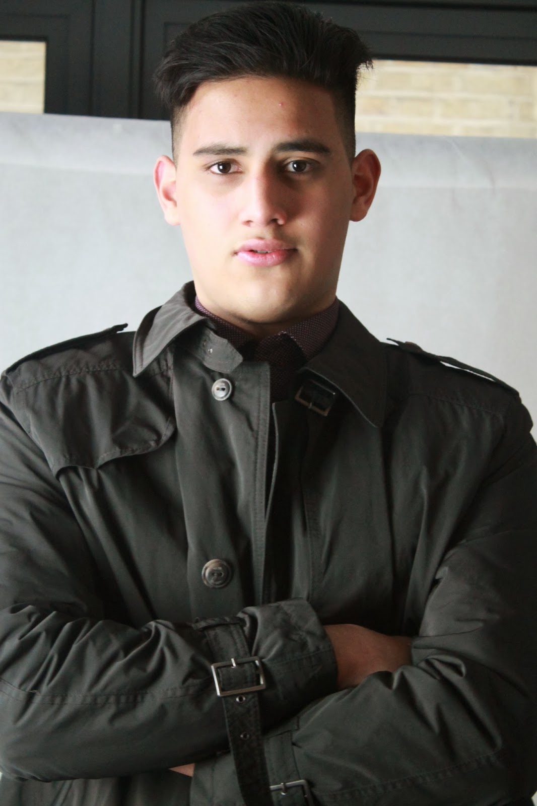
The model in this image lacks facial expression

The model lacks facial expression

This image was taken in landscape and so is unsuitable

The model is looking away in this picture
Monday, 3 March 2014
DPS Evaluation draft
DPS Evaluation Draft
My DPS
follows the standard conventions of a DPS. The picture I used covers one whole
page and I have altered it to aid and establish a rock genre theme whilst also
making the model stand out. I used a pull out quote in my article to split the article
up and give the page design a less mundane look. In the main body of text, I
have made use of drop capped lettering, captions and page numbers to conform to
the standard conventions of a double page spread. The colour scheme is
consistent throughout; the colours red white black and yellow are commonly
portrayed as a way of easily distinguishing between different pieces of text.
In addition
to this, the columns in my DPS are aligned both vertically and
horizontally. I have also used dividers
in-between columns as a visual aid to the reader; despite this subverting from
conventions, I believe it will act as a welcome to my target audience who may
not be too familiar with magazine layouts.
I subverted
from the convention of having a consistent font style by using a different font
for the headline. By doing this I can entice the reader through the contrasting
headline and through the use of a standard font style for the main body of text,
allow the user to read the text without difficulty.
It is clear
what genre my DPS revolves around through the use of the colour scheme, model
and clothing. The model has a hardened expression to symbolise rock, this is
also shown through the dark clothing and use of drumsticks as a prop. I have
used the model as an artist and clearly shown this through the typical clothing
that rock artists wear; moreover the artist is holding a pair of drumsticks
which indicated that he is a drummer and this is what he is known as through
the mentioning of him in the article. In terms of mise-en-scène I have taken
advantage of a brick wall as a way to portray the rough and tough attribute of
rock.
Tuesday, 25 February 2014

Wednesday, 18 December 2013


Tuesday, 10 December 2013
DPS photo

1. This picture will not be used as the model is not in the center of the frame and he is smiling.

2. The model is in the center of the frame looking straight at the camera. The use of the drumsticks as a common symbolism of rock, best displays the attitude of the genre.

3. The model is holding drumsticks which is a common theme for rock. The black clothing also represent the genre as well as the moody facial expression. The shot was taken at a low angle in order for the natural light to cast a shadow on his face and create a darker tone.

4. I will not use this picture as the model is smiling.
Tuesday, 3 December 2013


Tuesday, 26 November 2013
Survey Monkey Results
What genres and sub-genres do you listen to?
Response 1: rap hip hop pop
Response 2: rock
Response 3: classical baroque minimalism orchestra


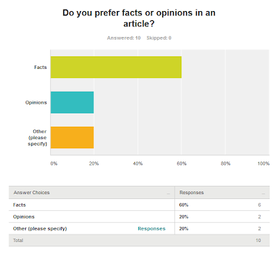
Do you prefer images or text in a magazine?
Response 1: images
Response 2: images
Response 3: text

Response 1: rap hip hop pop
Response 2: rock
Response 3: classical baroque minimalism orchestra
Response 4: reggae
classical
hip hop
rap
rock
Response 5: hip hop
pop
rap
gangster rap
Response 6: rock
alternative rock
indie rock
Response 7: rock and heavy metal
Response 8: Heavy Metal, Death Metal, Progressive Metal, Black
Metal, Groove Metal. Progressive/Technical Death Metal, Blackened Death
Metal, Doom Metal, Sludge Metal, Hard Rock, Thrash Metal, Symphonic
Metal, Indie Rock, Classic Rock
Response 9: rock
indie rock
alternative rock
metal
Response 10: Rock
indie rock
alternative rock
general rock
pop rock
avantgarde
big band
blues
classical
hip hop
indie
jazz
rap
reggae 


Do you prefer images or text in a magazine?
Response 1: images
Response 2: images
Response 3: text
Response 4: text
Response 5: images
Response 6: no preference
Response 7: i think that they are both very important and so a balance between the
two is needed yet if i had to choose between the two i would go for
images
Response 8: I prefer a good equal amount of both
Response 9: images
Response 10: Text, depending on the quality

Subscribe to:
Posts (Atom)